Little Lemon
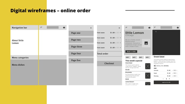
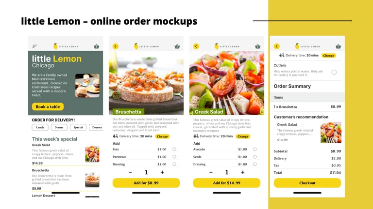
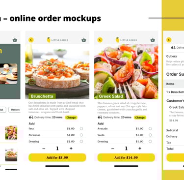
There is a mix of information on the current little Lemon website with inconsistent labels, actions, and designs. For example, there is no add button on the individual dish information page. As a result, the users feel confused about the steps in placing orders.
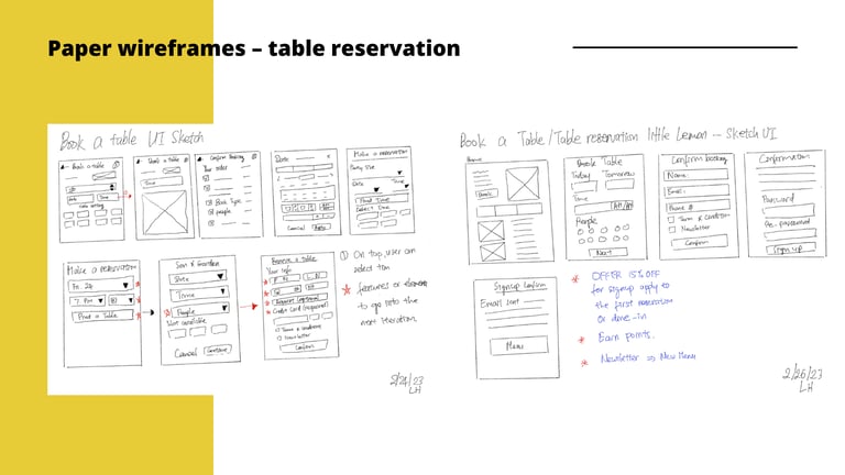
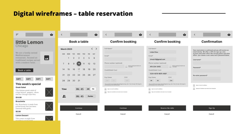
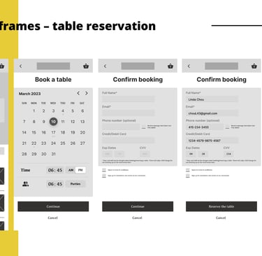
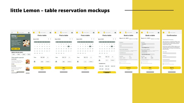
The reservation table function is not intuitive in allowing users to reserve a table for dine-in. The user can't choose the date and time properly and filling the form feels like taking forever to complete.
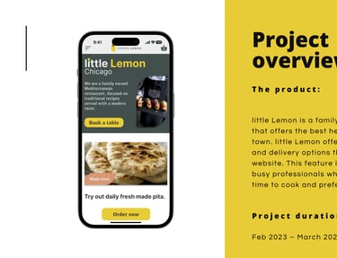
The product:
Project overview
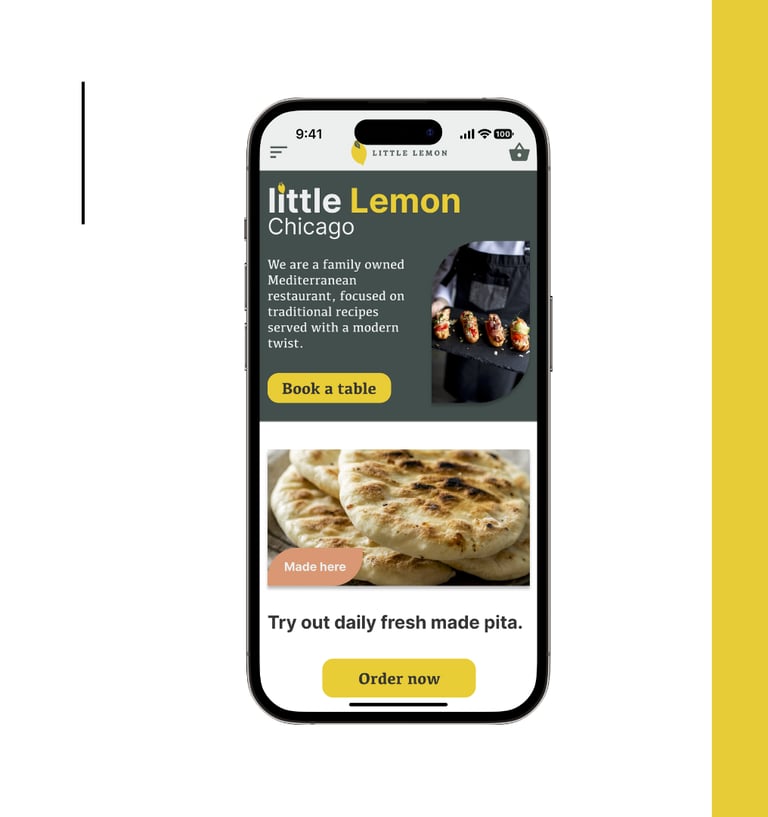
little Lemon is a family-owned restaurant that offers the best healthy options in town. little Lemon offers dine-in, take-out, and delivery options through their website. This feature is important for busy professionals who don't have much time to cook and prefer a healthy option.
The problem:
The goal:
Redesign the little Lemon website to address mixed information with inconsistent labels, actions, and designs. Improve user flow and interaction with the little Lemon website in desktop and mobile versions.
Understanding the user.
Persona 01
Persona 02
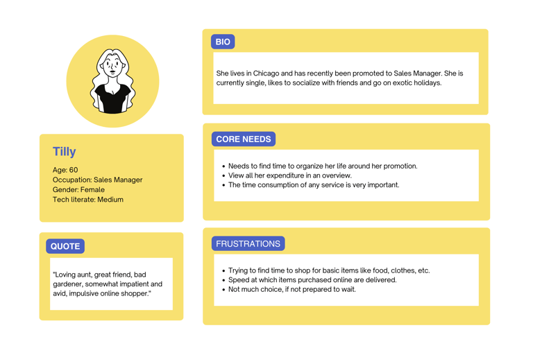
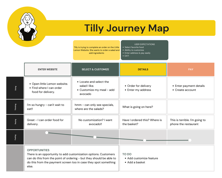
The problem statement: Tilly finds it hard to place an order through little Lemon website. She finds mixed information, confusing labels and buttons.
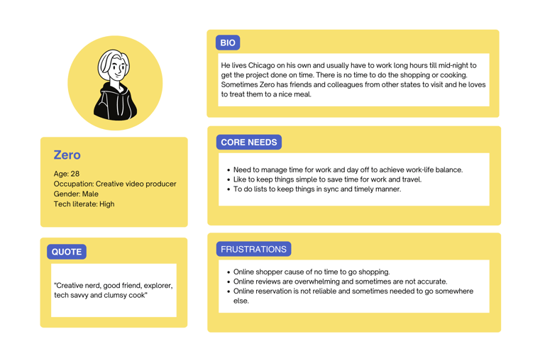
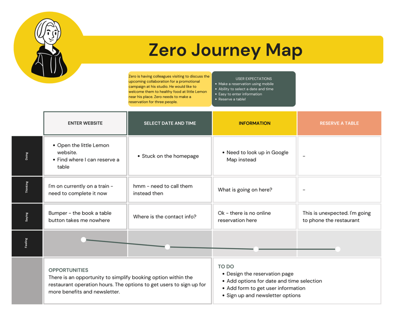
The problem statement: Zero is excited about online reservations, but there is no such feature on the little Lemon website. The book a reservation button doesn't lead to anything or a new page.
Starting the design.
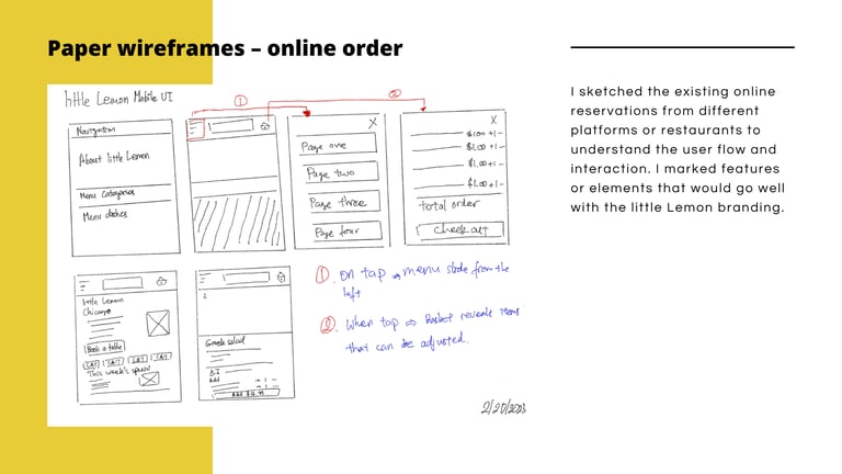
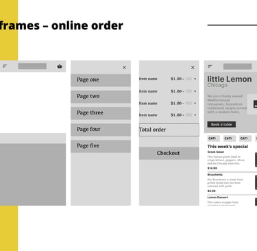
Online order
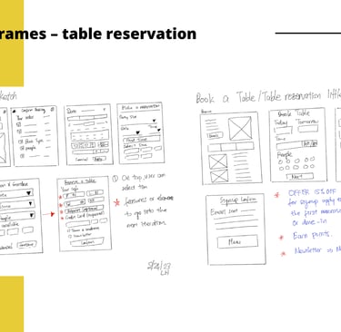
Table reservation

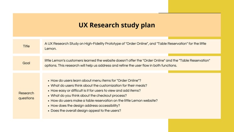
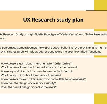
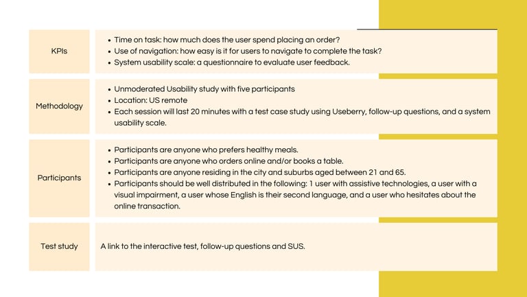
User research study.
Going forward.
Takeaway
Follow the design principles to evaluate the site.
Learn what works and does not.
Identify the problem to solve.
Address the user's pain points.Takeaway
Next steps
Recruit participants for the usability study to get feedback on the high-fidelity prototype.
Work on the interaction design that can aid and improve the user experience with the website.
Check the Web Accessibility Guideline to ensure that design is inclusive for all users.